Retail / Visual Design, Product and Interior Design
Espressoh. A store made of light, coffee and some of the Milanese things we love.
INTRO
Espressoh opens its first flagship store in Milan, a project with an essential design that brings the classic Italian coffee shop towards a contemporary dimension with rituals and an easy approach typical of our reference model. Located in the Cinque Giornate area with a Ceppo di Gré marble facade, the store, thanks to the five windows facing the street, has a continuous and direct relationship with the city.
CONCEPT
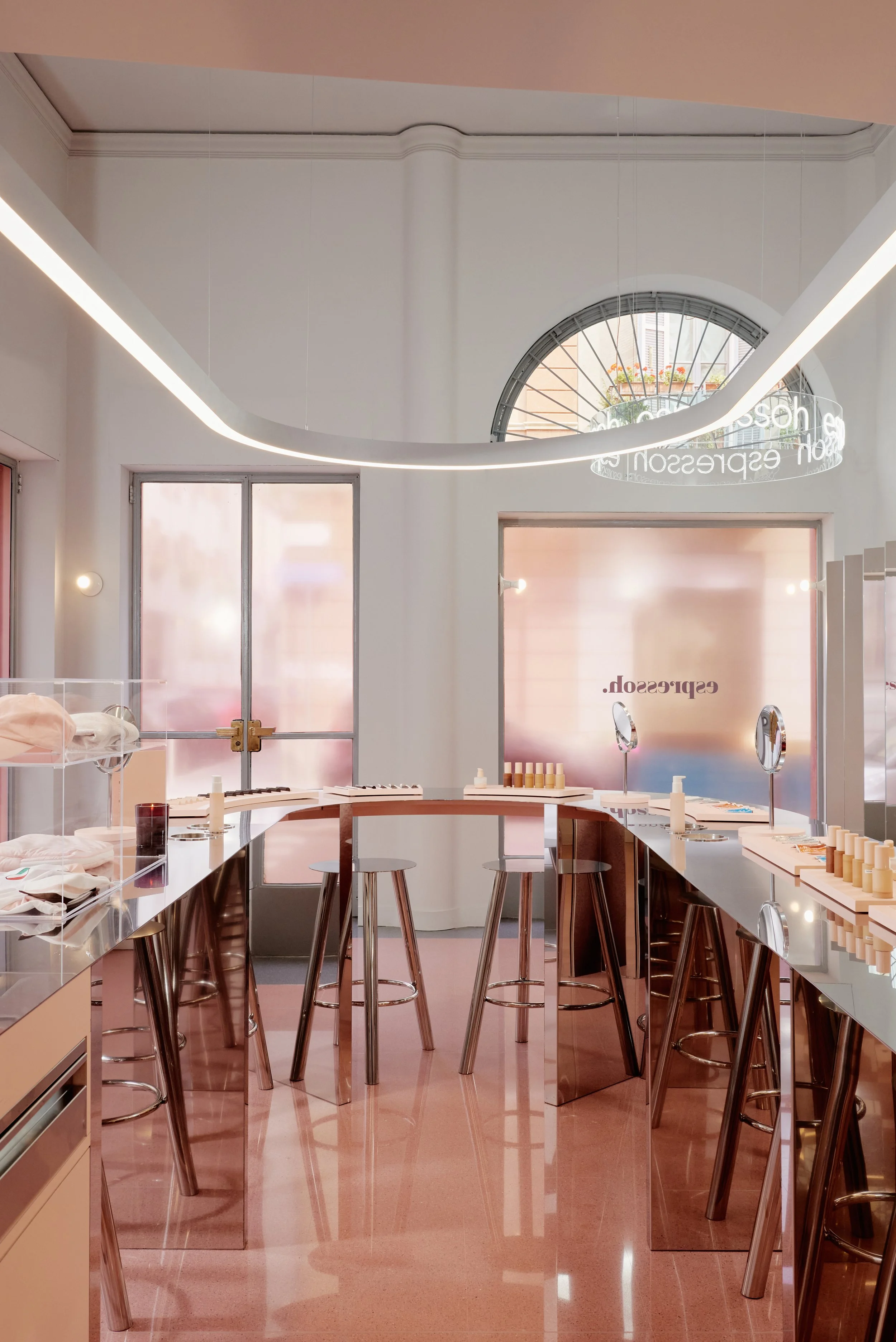
We designed a rigorous layout composed of two large elements: the curved bench surrounded by high stools in the center of the space and the mirrored screen boiserie on the backdrop. We were inspired by the historic Milanese pastry shops and bars that we love to frequent: places where fluid counters interact with scenographic chandeliers and walls are decorated with coverings, photographic images and mirrors.
PROJECT
The protagonist is the large curved counter that defines the experience in the store: around it bar stools welcome customers and invite them to interact with the products by trying the textures and identifying the favorite nuances recommended by the Espressoh team.
The counter contains all the functions: in addition to the beauty bar for product testing, it has a display case of merchandising and special products, the espresso machine for preparing coffee, an essential element of welcoming the brand.
The paravento boiserie designs the backdrop of the sales space. The double-sided nature of the pleat, which on one side is reflective and on the other contains photographic content, creates a dynamic effect and illustrates the interaction between light, texture and colors.
Mirror metal is confirmed as the material of choice for our projects for Espressoh. It alters the perception of volumes by reflecting everything that surrounds it: the color of the Milanese facades, the pattern of the terrazzo floor, the moving silhouettes of the people in the store and of those who, outside, approach the windows.
The interaction with the city also takes place through the facade: the pink chromatic filter placed on the windows paints a Milan colored in Espressoh pink for the people inside the store. Conversely, for people outside the store, it is the interior that appears entirely pink.
At the conceptual level we imagined a transparent but colorful visual layer with which to filter spaces, objects and people. We were inspired by the light textures of Espressoh products and their ability to interact empathetically with light and color.
/ ’nɛs:i / Naessi / ¹ Espressoh flagship store / ² Espressoh / ³ Retail / ⁴ aluminum / ⁴ silvermirror / ⁵ Stefania Zanetti / ⁵ Naessi / ⁷ cosmetics / ⁷ beauty / ⁷ flagship store / ⁷ coffee / ⁷ italian bar / ⁷ lifestyle / ⁹ Milano 2024 /
¹ Project name
² Client
³ Category
⁴ Details
⁵ Photographers
⁶ Collaborators / partners
⁷ Keywords
⁸ Press
⁹ Exhibitions and events
¹⁰ Related sounds
¹¹ Other links
#espressoh #popup #flagshipstore #retail #brand #design #interiordesign #aluminum #silvermirror #metalfurniture #madeinitaly #craftsmanship
*Photo courtesy of Espressoh


